
When Did Album Covers Become Art?
For most of the history of recorded music, the record cover had a very simple job: protect the record.
The idea that the sleeve itself might deserve to be looked at, collected, discussed, or even exhibited as an artwork came later.
But there was no single moment when someone announced that album covers were now art. The transformation happened gradually, as several things converged: new recording technology, better printing, modern graphic design, photography, jazz, popular culture, and—eventually—musicians who began to think of an album as a complete artistic object rather than a container for songs.
By the late 1960s, the question had almost reversed itself.
It was no longer:
How should we package this record?
It was:
What should this record look like?
And somewhere between those two questions, the album cover became an art form.
Before the picture: the record as a package
The earliest records were not particularly interested in visual identity. Shellac discs were fragile, relatively small, and generally sold in plain paper sleeves or simple packages whose primary function was protection.
The situation changed dramatically with the arrival of the 12-inch LP in 1948.
Columbia Records introduced the long-playing microgroove record that year, creating a larger, more durable format capable of holding an album-length program. The 12-inch sleeve also created something the previous record formats had lacked: a large square surface on which a visual identity could live. The Library of Congress
That distinction matters.
The physical dimensions of the LP were not simply a technical detail. They created a new piece of visual real estate.
And designers noticed.
Alex Steinweiss and the blank square
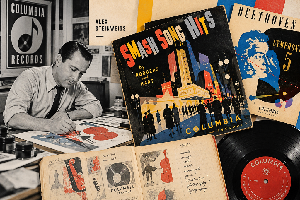
One of the crucial figures in this story was Alex Steinweiss, an art director at Columbia Records.
In the early 1940s, Steinweiss began treating record packaging as a communication problem rather than merely a protective one. Instead of leaving the sleeve as a typographic label, he introduced illustration and photography designed to evoke the character of the music.
A frequently cited landmark was Columbia’s 1940 Smash Song Hits by Rodgers & Hart, for which Steinweiss used an image of the Imperial Theatre in New York. The blank sleeve had effectively become a poster. Smithsonian Magazine
That sounds obvious now.
It wasn’t.
Steinweiss understood something that would become fundamental to album design: you could make someone want to hear music by showing them an image before they had heard a note.
The cover became an advertisement, but something more interesting happened at the same time.
It became an interpretation.
The designer was no longer simply identifying the contents. He was suggesting how those contents might feel.
That distinction would become enormously important.
Then the LP changed the scale of the idea
When Columbia introduced the 12-inch LP in 1948, the format gave this new visual language a much larger and more permanent canvas. The Library of Congress describes the introduction of the LP as creating a new musical unit of consumption: the album. The Library of Congress
The square sleeve was almost perfectly suited to modern graphic design.
It could accommodate:
- photography;
- illustration;
- typography;
- collage;
- geometric abstraction;
- color;
- negative space.
And because the same format was repeated from record to record, designers could begin developing visual systems rather than isolated images.
This is where jazz became particularly important.
Jazz discovered that music could have a visual rhythm
During the 1950s and 1960s, record labels increasingly gave designers freedom to develop distinctive visual identities.
Perhaps the clearest example was Blue Note Records.
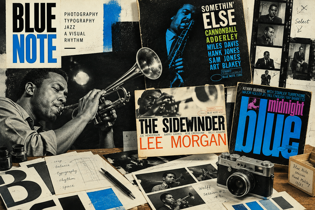
Photographer Francis Wolff made striking black-and-white photographs of musicians, while designer Reid Miles transformed those photographs into compositions using typography, cropping, scale, color and geometric relationships.
The result wasn’t simply a picture of a jazz musician.
It looked like jazz.
MoMA’s collection includes numerous Blue Note covers designed by Miles, including Jutta Hipp with Zoot Sims (1957), Hub-Tones (1962), The Rumproller (1965) and Unity (1966). MoMA treats these objects explicitly as works within its Architecture and Design collection. The Museum of Modern Art
Cooper Hewitt’s recent Art of Noise exhibition makes the connection even more explicit: by the 1950s, designers were using bold typography, innovative photography and abstraction to visually express the essence of music, with Reid Miles’ Blue Note work becoming one of the defining examples. Cooper Hewitt Smithsonian Design Museum
This is one of the most fascinating transformations in the history of graphic design.
The designer wasn’t illustrating a song.
The designer was trying to visualize sound.
A photograph could be cropped aggressively. A word could become a shape. Letters could collide with the edge of the square. Empty space could create tension.
The cover didn’t tell you what the music sounded like.
It tried to make you feel its rhythm before you played it.
The cover becomes part of the artist’s identity
By the 1960s, something else was happening.
Popular musicians were becoming visual personalities.
The photograph of the artist was no longer merely an identification device. It became part of the mythology surrounding the artist.
And then came a remarkable moment: artists themselves began crossing into the world of album design.
Andy Warhol is perhaps the clearest example.
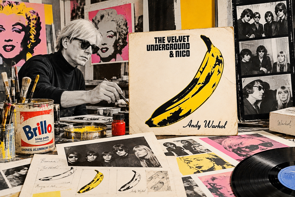
Warhol became involved with The Velvet Underground and created the cover art for The Velvet Underground & Nico. The Whitney Museum notes that Warhol produced the band and provided the cover art for its first album, released in 1967. Whitney Museum of American Art
MoMA’s collection even catalogs the record itself as a work associated with Warhol. The Museum of Modern Art
This changes the question again.
If an established visual artist creates the cover of a record, is the result advertising?
Packaging?
Graphic design?
Or an artwork that happens to be attached to music?
There isn’t necessarily a single answer.
And perhaps that ambiguity is precisely what made the period so interesting.
Then came Revolver
In 1966, The Beatles released Revolver.
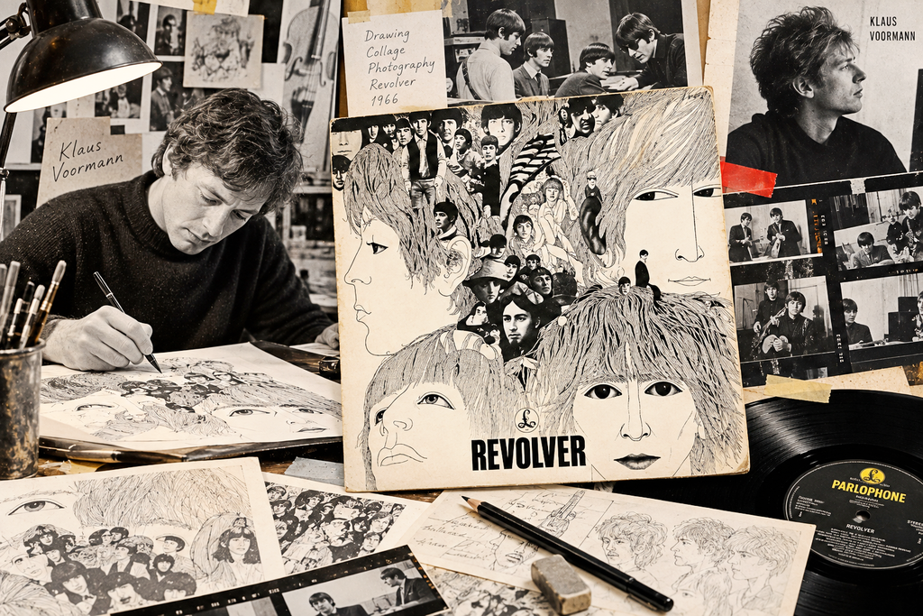
Its cover was designed by Klaus Voormann, an artist and longtime friend of the band from their Hamburg days. The Beatles’ own archive describes the distinctive sleeve as Voormann’s work. The Beatles
Voormann combined drawing, collage and photographic imagery into something that looked unlike the conventional pop-star portrait.
And the design received something extraordinary for the time:
a Grammy.
At the 1967 Grammy Awards, Voormann won Best Album Cover, Graphic Arts for Revolver. Grammy
That award is revealing.
The music industry was beginning to recognize the album cover not simply as packaging but as a creative discipline deserving its own artistic category.
And Revolver was particularly appropriate.
The album itself represented a band moving away from the conventions of pop performance toward increasingly experimental studio work. The Beatles’ official site describes the album as a major expansion of their musical direction, while the cover simultaneously abandoned the straightforward photographic portrait. Grammy
The music was changing, and the image changed with it.
Then the Beatles turned the album into a world
A year later came Sgt. Pepper’s Lonely Hearts Club Band.
And suddenly the album cover wasn’t merely an image.
It was a scene.
Peter Blake and Jann Haworth created the famous Pop Art collage in collaboration with the band, surrounding the Beatles with a crowd of historical and cultural figures. The Beatles’ own archive describes it as an extravagant Pop Art cover built around a three-dimensional collage. MoMA catalogs the cover as a work by Blake, Haworth and photographer Michael Cooper. The Beatles
The sleeve also contained lyrics, cut-outs and additional printed material. It wasn’t simply a front cover anymore. It was an environment.
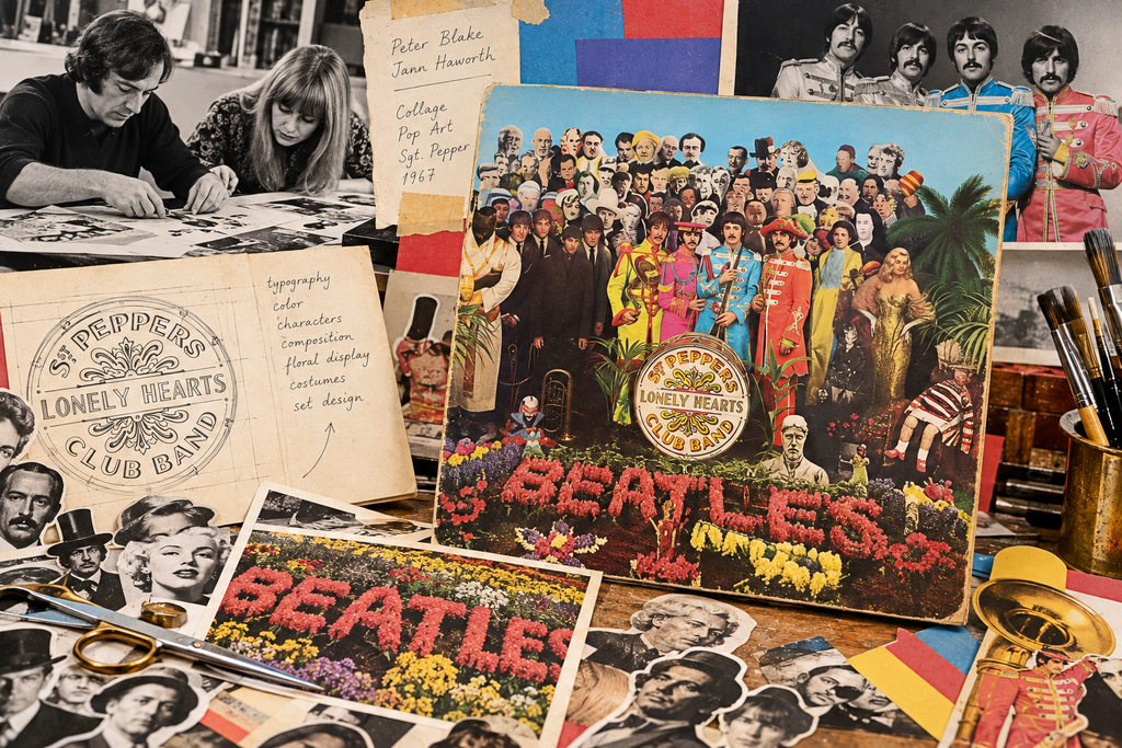
And that was important.
The album had become something you could enter.
You could stare at it while listening.
You could discover details.
You could recognize people.
You could argue about who was included.
You could own it.
The object surrounding the music had become part of the experience of the music itself.
The image no longer had to explain the music
This may be the most important change of all.
Early album art often tried to communicate something about the contents:
Here is the performer.
Here is the orchestra.
Here is the style of music.
But increasingly, designers began doing something stranger.
They created images that didn’t explain the music at all.
They created associations.
Mysteries.
Worlds.
Sometimes the relationship between the music and the image was obvious only after you had listened to the record.
This opened the door to one of the most influential design groups in popular music:
Hipgnosis.
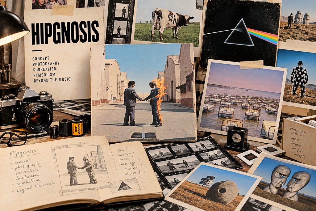
Founded in 1967 by Storm Thorgerson and Aubrey Powell, Hipgnosis became famous for surreal, highly conceptual album covers for artists including Pink Floyd, Led Zeppelin, Genesis, Peter Gabriel and others. The Rock & Roll Hall of Fame describes the collective as transforming album-cover aesthetics by moving away from the conventional group photograph toward often surreal imagery. Rock & Roll Hall of Fame Museum Store
Think about what happened here.
The musician didn’t necessarily need to appear.
The album didn’t need to show a guitar.
The cover didn’t need to show anything that literally represented a song.
The image could operate like a visual metaphor.
That is a very different idea of what packaging is supposed to do.
So when did album covers become art?
There isn’t a single date.
Steinweiss made the sleeve visually expressive.
The LP gave that expression a proper canvas.
Blue Note demonstrated that graphic design could translate musical character into visual form.
Warhol and other artists blurred the boundary between fine art and record packaging.
Voormann’s Revolver demonstrated that album design could receive major artistic recognition.
The Beatles’ Sgt. Pepper turned the sleeve into a cultural environment.
Hipgnosis demonstrated that an album cover could become an independent conceptual artwork.
By the late 1960s, the transformation was essentially complete.
The record sleeve was no longer something wrapped around the music.
It had become part of the music’s identity.
And then something strange happened
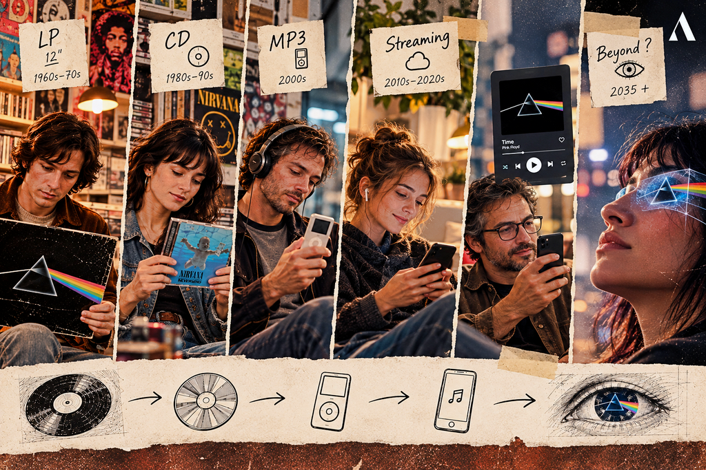
For decades, the album cover became larger in cultural importance while the physical object itself eventually became smaller in people’s lives.
The LP gave us a 12-inch square.
The CD reduced it.
The MP3 nearly eliminated it.
Streaming turned the album cover into a tiny square on a screen.
Yet the image survived.
In some ways, it became even more important.
A listener today may encounter an album first as an image on a phone before ever hearing a note.
Which means that the question Steinweiss was asking in the 1940s—
“How can an image make you want to hear this?”
—is still being asked.
Only the canvas has changed.
And perhaps that’s why the greatest album covers still feel strangely complete when we see them decades later. They don’t merely identify a recording.
They have become the way we remember the recording.
A few names worth following from here
Alex Steinweiss → Reid Miles → Francis Wolff → Andy Warhol → Klaus Voormann → Peter Blake & Jann Haworth → Storm Thorgerson & Hipgnosis.
That’s not a straight line, and it shouldn’t be.
It’s more like a set of connections between music, modern art, photography, typography, Pop Art, advertising and graphic design.
And that’s probably the more interesting history of the album cover: not the story of packaging becoming art, but the story of different kinds of artists gradually discovering that the square on the front of a record was a surprisingly powerful place to make an image.